What is your first impression of Wayzim?
The industry leader in express sorting? A high-tech enterprise? Intelligent manufacturing? Or Wayzim blue?
Big news! Recently, in order to improve the brand image and adapt to the company's new developmental needs, Wayzim has officially launched a new VI (visual identity) system. The promotion content will be displayed with the new LOGO.

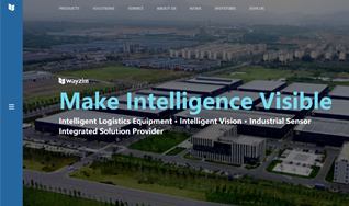
The English slogan is also updated to: Make Intelligence Visible.
This upgrade is the starting point and witness of a new phase of development for Wayzim. From its establishment in 2016 to its successful listing in 2021, step by step, Wayzim has entered a brand-new stage of globalization. During this process, Wayzim has fully optimized the old VI based on the brand ideology and consideration of the products and the industry. This update endows new connotations on the LOGO. The size after adjustment becomes more pleasing to the eye and the symbols and fonts are more concise and elegant. The classic Wayzim blue also implies firmness, steadiness, and internationalization.

Order in Revolution
Row Upon Row / Line Upon Line
Wisdom at Creation
Advanced Manufacturing / Digital Empowerment
New Logo for New Development
The advancement of the company's strategies and the expansion of business channels constitute the driving force and general background of this VI upgrade.
Wayzim is a leading supplier of intelligent logistics equipment, intelligent vision, and industrial sensors. As one of the few companies in the world with intelligent logistics systems and the capabilities to research, develop, design, and produce the core parts of the system, Wayzim provides integrated intelligent solutions for conveying, sorting, and warehousing for industries including express delivery, e-commerce, airports, and manufacturing companies. At the same time, Wayzim also provides core components for intelligent manufacturing such as drum motors, industrial-grade barcode / QR code recognition, volume measurement, 2D/3D vision-guided positioning, and defect detection.

Therefore, the new logo is an innovation based on the original logo. It visually reflects a multi-dimensional extension, signifying that Wayzim is actively extending to the upstream and downstream of the industrial chain, related industries, and synergy industries on the basis of solidifying the core business of the company to move forward steadily towards a cross-industry and multi-domain synergy.
The Intersection of Longitude and Latitude. The Creation of All Things.
The new LOGO uses four symmetrically distributed rhombuses and the letters in the word “wayzim” as the main design elements. The simple graphic structure reflects the international positioning of the brand, adding more customer perceived value through symbolization.
The auxiliary graphic is extracted from and inspired by the intersection of longitudinal and latitudinal lines. The shape resembles the basic sorting trolley of the sorting equipment, reflecting the industry attributes.
Interpretation of the Figure and the Pronunciation
Meaning: the diamond shape of the logo and the letters “wayzim” indicate the professional strength of Wayzim in the field of intelligent logistics systems and intelligent manufacturing and Wayzim’s aim to serve high-quality development with technological innovation.
Figure: Simple and elegant, beautiful and full of tension. The diamond-shaped elements in ice blue embellish the logo with visual focus.
Pronunciation: 3 syllables, easy to read and rhythmic, strong and powerful. Say it with me, wayzim.
New Visual for New Culture

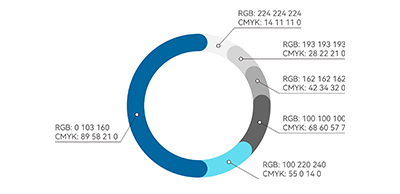
The new logo adopts blue as the main color of the VI, which is visually balanced and looks neater. A more vibrant and eye-catching ice blue is boldly adopted, making the overall look more harmonious, and highlighting the vitality and vigor of the brand.
At the same time, the layered blue color corresponds to the inclusiveness, steadiness, and wisdom of the people in Wayzim. Ice blue, which is close to white, gives people a soft and refreshing feeling, while Wayzim blue, which is close to black, gives people a sense of rationality and steadfastness.
The Beauty of Harmony
Symmetry, continuity, illusion, and unity – independent yet interrelated
The Beauty of Rationality
Strictness, regularity, proportion, rhythm – stable and orderly
The Beauty of Sensibility
Tension, extension, changes of color – the mixture of vitality and the expansion of dimension
The new Wayzim VI will be applied to corporate culture display, office supplies, corporate environment, clothing, accessories, advertising media, signage, packaging system, gift customization, display, printing, and publishing.
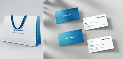
Demonstrations of Some Applications
Today, with the new unified visual identity system, Wayzim upgrades the corporate image and contemplates the future development of the industry, refining the core values of the brand to make it more in line with the company’s positioning and the market’s demand. To help the logistics and express industry achieve “cost reduction and efficiency increase”, based on the strategies for the core technologies, Wayzim has realized the vertically integrated layout of R&D, production, and manufacturing of systems, solutions, and core components. The company has continuously increased its investment in intelligence to provide strong support for the rapid development of the industry. Facing strong market demand, Wayzim has expanded its business scope to the manufacturing industry and new energy industry. The company is looking forward to applying core components such as visual sensors to intelligent manufacturing, taking the key step toward intelligent manufacturing enterprises.


